Graphic Design in Television
2. Early Graphic Design in Television
The new medium of television followed a precedent set by the existing mediums of mass communication such as radio and print in that it provided a constantly changing content with programmes such as sport, newsreels, cookery demonstrations and plays. These all required some sort of graphic introduction and this usually consisted of hand drawn lettering for titles and credits. The graphic artist was also required for programme announcements, intermissions and interludes, as well as inter-programme information such as maps and charts. Much of televisions graphic needs (as in the feature film, newsreel and documentary industries) were met by signwriters for lettering and commercial artists and card animators for illustrations.
The lack of experiment and invention in television graphics between 1936 and 1950 became evermore apparent to many inside and outside the industry. In 1951, the Festival of Britain was showing a new awareness of design, one that wasn't being shown in television. As it was beginning to be seen as an influence on public taste and opinion, the BBC decided that a Head of Design should be appointed, and so in 1953 they chose Richard Levin.
Levin came from a background of exhibition design, working on the BBC's public exhibitions since 1933, organising propaganda exhibitions for the British Army during the Second World War and as a result given the responsibility for organising the land travelling section at the Festival of Britain. His original brief was related to set design but it wasn't long before Levin realised the need for a graphic designer.
He knew from his experience in exhibition design what an important part graphics could play in enhancing display design, but the BBC wasn't so convinced. To prove his point, Levin photographed every occurrence of graphic design in a weeks worth of programming, which he then mounted onto a large roll and presented to the senior management with the words That's why I need a graphic designer
. As a result he was able to employ John Sewell, British televisions first full-time graphic designer in December 1954.
John Sewell was a recent graduate of the Royal College of Arts School of Graphic Design who specialised in illustration and also had an interest in filmmaking. His role in television meant that he would have to draw on his skills to produce lettering, present stills and produce simple animated sequences, immediately upsetting the five signwriters already employed by the BBC who provided the bulk of televisions graphic needs.
Over the next few years, this very much considered experimental section, was built up to a staff of about 8-9 full-timers including those who specialised in calligraphy, photography and those who had backgrounds in advertising. However this section was considered not to be of much importance, and even though overall control of design policy was still in the hands of Richard Levin, graphic design didn't enjoy the freedom of an independent department. It was part of Scenic Design, which organised the briefs and budgets, and graphic design was low down on a list that included set design. It wasn't until 1963 with the expansion of television design, that Richard Levin allowed an element of self-management with the appointment of a Graphics Manager. The section was also expanded from the 8-9 full-timers that were present in 1960, to between 18 and 20 designers in 1963. However this was due mainly to the anticipated launch of BBC2 in 1964.
Figure 2a


Title sequence from 'Armchair Mystery Theatre' (ABC 1967)
Graphic Designer: Tony Guy
The quality of television broadcasts and receivers was crude to say the least. In terms of the broadcasts, they were limited to black and white and a resolution of only 405-lines. This was further worsened by the quality of the receivers, with television manufactures more concerned with the decoration of their sets (which at that time were 80% furniture and 20% screen) as opposed to refining the circuitry inside, and this resulted in pictures suffering from poor definition. Up to 20% of the screen was considered unusable to the graphic designer due to the lack of focus around the screen's edge and also the fact that different television sets cut the picture off at different points.
This meant graphics produced for television had a huge number of restrictions put on them. Lettering had to be large and bold with strong tonal contrast and illustrations had to use fairly heavy lines and lack detail ('Op' and 'Pop' art themes were common used during the end of the fifties). Designers also had to work from the center of the screen outwards, so as to ensure their work would be seen.
Figure 2b


Title sequence from 'Wednesday Magazine' (BBC 1958)
Graphic Designer: Bernard Lodge
Figure 2c


Title sequence from 'Kingsley Aimes Goes Pop'
(Associated Rediffusion Early 1950's)
Graphic Designer: John Tribe In America, William Golden was making a name for himself in television and was arguably the medium's first graphic designer. Golden was born in 1911 in New York, where he attended a vocational high school in which he studied commercial design and photoengraving. In 1937, he joined the CBS Radio Network and soon became their art director.
After his career was interrupted by World War II, he returned to CBS and produced many award-winning promotional pieces often using the images from the likes of Ben Shahn and the then unknown Andy Warhol (who later became an influence on the illustration styles employed by graphic designers in television).
However his greatest creation was his corporate identity for CBS Television the well-known CBS 'eye' (see below) first aired on the 6th November 1951. He died at the age of 49, only a few months after being awarded art director of the year by the New York Art Directors Club in 1959.

Figure 2d
Corporate logo for CBS Television
(CBS 1951-Present Day)
Graphic Designer: William Golden
It was Saul Bass though, who was to have the most influence on designers in the profession even though he had closer links with film than television. Saul Bass was also born in New York in 1920 where he studied at the Art Students League and Brooklyn College and worked for a number of years. In 1946 he moved to Los Angeles, were he began to produce graphics for advertising.
His work on titles began almost by accident when working on an advertising campaign with the filmmaker Otto Preminger. Bass was designing a graphic symbol of a flame and a rose when he and Preminger came up with the idea of putting this image at the beginning of the film and animating it. Bass did this, adding credits to run over it, and from that moment on, Saul Bass became a title designer. He then went on to produce the titles for Preminger's film 'The Man with the Golden Arm' in which:
Bass used abstract shapes to portray the disjointed and unhappy life of an addict.
(Montagu 1991: 5)
as well as 'Grand Prix' and 'Walk on the Wild Side. Bass later produced the title sequence for Alfred Hitchcock's film 'Psycho', in which he also directed the famous shower sequence. This is what he became more interested in and moved from the title sequence, to directing sequences in feature films. Saul Bass revolutionised filmmaking. He allowed the title sequence to become an integral part of the film - the prologue in which the mood could be set instead of just a series of captions.
Bass was also successful in designing many corporate identities with clients including AT&T, Exxon, Quaker Oats and Warner Communications.
Figure 2e


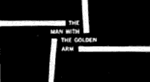


Title sequence from 'The Man with the Golden Arm' (Directed by Otto Preminger 1967)
Graphic Designer: Saul Bass
Bass had most influence on the early graphic designers in television due to the fact that it was a new medium with precedents for design having to be found elsewhere. Often this was from print but Bass was the only one who provided a potential influence. However, his influence was often hard to emulate on television with its many technical, time and budgetary constraints. In fact it was also difficult for them to find inspiration from anything they, their colleagues or their predecessors produced, because for a long time video was not used to keep a record of programme output. Advertisers also found they had the same problems when they encountered the moving image with the arrival of commercial television in 1955.
Television Graphics
Essay written as part of my BTEC Foundation Art Diploma, and submitted early 1999.
Shop with Amazon.co.uk
- Brand Identity for Television
- Lambie-Nairn