First Look at MacOS X - Apple's Next Generation OS
Expected for release later this year, and to be shipped with all new Macs from early 2001 Apple is finally ready to show off it's next generation operating system - MacOS X.
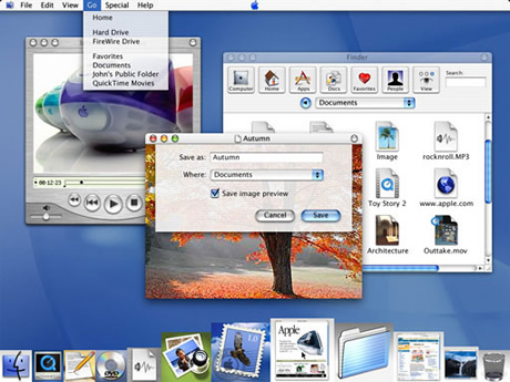
Developer Preview 3
Based on the same design ideals found in the iMac, iBook and the new PowerMacs, it also introduces some new technologies and improves on existing ones. OS X is hoped by Apple to reassert its leadership in operating system design.
With a completely new interface, dubbed Aqua by Apple due to its fluency, colour, translucency, depth and motion, it brings together such aspects of design we have become used to from the makers of the iMac.
One of the most notable features of this new interface is it's lack of clutter - the Finder and Control Panels (renamed Preferences) have been reduced to single windows, as well as a new 'single window mode'.
When you are in this mode, only the active window is visible whilst all others are hidden. When you wish to open another application or document, the system automatically makes its window active and hides the previous. How well this works in practice is debatable.
'Sheets'
One incredibly useful feature is the new dialog panels (such as save, open and print). These are attached to their respective windows and no longer have to be acted on straight away, leaving you to work on other documents.
Aqua also supports larger icons of up to 128x128 pixels as opposed to previous 32x32 constrainments, making them more legible on today's higher screen resolutions. It also allows document previews in icons (such as the one's Photoshop produces) to be far clearer as well as producing a greater creative scope for icons allowing photo quality.
The Dock
Where the new interface maybe let down is with its new Dock which sits at the bottom of the screen and holds folders, applications, documents, storage devices, minimised windows, links to websites... the list is endless. Apple seems to be asking the Dock to replace the existing Apple Menu and Application Switcher as well as behave as an application launcher, all at the same time. This is a tall order and results in confusion and a Dock that quickly becomes crowded.
As its icons reduce as more items are added, as you run your icons over it the front-most icon comes forward. Although this looks nice, it's only been introduced because of the Dock's weakness. Apple has a lot of work to do here if it is to be as successful as it hopes.
The Finder
Although the new Finder is based on NeXTStep, it has irritated many Mac users due to it's similarity to Windows 'My Computer'. Now all devices (and networks) are accessed through the Finder, with only aliases to these allowed on the desktop.
Based on the single window concept, there are three options for viewing your system. The popular folder and list views remain, although these have been altered so as to remain in the same window. Double clicking on a file no longer opens a new window, but instead replaces the current folder with that of the one you clicked on. A single click on a folder introduces a third option, the three column view. The single click brings the contents of the folder to the right and if you click a file, a preview is shown instead. A history is maintained in the short-term memory so you can always find your way back.
I think the new Finder is not that bad, and will just take time for many Mac users to get used to it. They'll soon find the lack of hundreds of windows floating round their screen very pleasant indeed. However, I do think Apple may be trying to imitate Windows a little bit seeing it has a lead over MacOS, and this is shown by its naming two of the buttons on the title bars as minimise and maximise (shudder!)
Foundations
| Aqua | ||
| Classic | Carbon | Cocoa |
| Quartz | OpenGL | QuickTime |
| Darwin | ||
As for the structure of MacOS X, it is as follows. Below the Aqua GUI lies three critical application environments called Classic, Carbon and Cocoa.
- Classic
- Allows the user to run all of his/her existing applications as-is, but will not be able to take advantage of MacOS X best features.
- Carbon
- Carbon applications on the other hand can, and these include pre-emptive multitasking (for a more responsive system) and protected memory (crash resistant computing at last - if one application crashes, other carbon apps won't!)
- Cocoa
- Cocoa is an advanced object-oriented programming environment which gives programmers a far greater range of tools to build the best next generation applications - MacOS X's built in e-mail client 'Mail' being one of the first of these.
Below this, lie three key technologies
- Quartz
- A powerful 2D graphics system (replacing QuickDraw) that produces pristine on-screen graphics and is based on Adobe's popular Portable Document Format (PDF)
- OpenGL
- The industries most widely supported 2D and 3D graphics API
- QuickTime
- QuickTime remains of course (with a file format is the basis for the MPEG 4 standard) allowing any type of image, sound and video format to be supported throughout the OS
The foundation for MacOS X is Darwin is responsible for key features such as protected memory and pre-emptive multi tasking.
Conclusion
Personally, although the reviews I've read of the beta releases show that there are a lot of problems that need sorting out such as the Dock, translucent windows becoming confusing when several are overlapping etc... I just can't wait!
First Look at MacOS X - Apple's Next Generation OS
Previous site content, written around the release of the Developer Previews in early 2000.
Article In Context
Five versions on from the developer previews, and looking at the screenshot from DP3 shows how far the OS has come. The Dock saw many refinements throughout later developer previews and early releases, and is now an essential part of the OS.
The recent release of 10.4 Tiger, and compatibility with Intel chipsets, now highlights it's underlying flexibility and possible future direction for Apple and MacOS X.