Out of the Blue
My Proposal
Before deciding on my final idea, I considered many other ways to develop the theme 'Blue' and also looked at other approaches towards representing 'Out of the Blue'.
Initial Ideas
Like most people, I started work on the project by looking at simple and possibly unimaginative ideas such as a mirrored tower that reflected blue in the surroundings and blue masks. Another was to create a 'blue trail'. This was a string of blue lights suspended in the air, or inset pavement lighting, linking the old gallery to the new one, in the form of a trail for visitors to follow. This linked nicely into what I found out about Feng Shui and it's relationship with blue - it being the colour of new beginnings and cold mourning. However it was obvious from the start that this idea would be very costly and so it never really took of.
Out of the Blue
I then looked at the phrase 'Out of the Blue', which immediately showed possibilities. I firstly took a very literal approach with the idea of an object being pushed through a blue elasticated material that would stretch to create to an image of the object. This is as far as this idea went.
However I elaborated on it with an idea that consisted of a folded surface which, when viewed from one direction simply displayed the colour blue, and when viewed from the other, displayed an image. The idea was that as you walked passed, you would see blue and then an image appearing from it (out of the blue). However problems with this method were that it would have to be viewed from one direction only as the piece relied on the viewer seeing the blue side before the image. As it would be placed in an area where people would be passing in both directions, I decided against this idea.
Old and the New
I decided to take the previous idea further, and brought back some of the elements of the 'blue trial' regarding the old and the new aspect of blue, by coming up with the idea of creating a line of 'slats'. These would be placed so you would be able to see an image of Walsall's past (that was directly associated with where the piece was sited) when you looked at it in one direction, and when viewed from the other you would be able to see Walsall at present. This also related to the Feng Shui relationship towards blue with mourning (the past) and (celebrating) Walsall's new beginnings. It would be an ideal time to produce such a piece as Walsall is undergoing a fair bit of change, not just with the new gallery, but with the redevelopment of the St. Paul's Street Bus Station, and development in the Town Wharf area of the town as well. However this idea was straying from the idea of 'Out of the Blue' which I was keen to keep. Also after looking closer at the colour and the contradictions that arrive from its definition, I decided to move on to what became the final idea.
The Final Idea
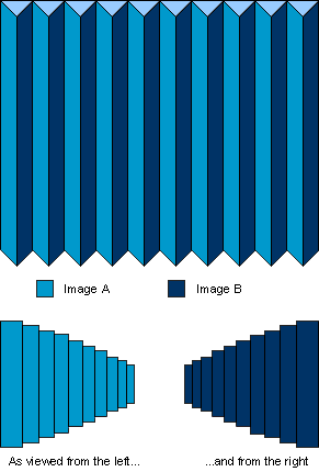
The idea I have finally settled on is to represent 'Out of the Blue' and the contradictory nature of blue in an interesting and interactive way. I plan to build a structure that allows two contradictory images to be viewed completely separate from each other, but also allows both images to be shown together at the same time. It is preferred that the viewer sees one image before the other so as to give the impression of 'Out of the Blue'. The two images are placed together on a folded structure as shown below. As the viewer moves towards the piece, they would first see a single image appear. At a later (or possibly the same) time, when they view the piece from a different direction, they would see a different image - one which is completely contradictory to the previous one they saw earlier.
The Images
Image A
Field on a sunny peaceful day
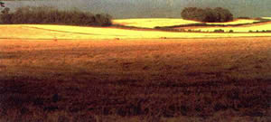
Image B
Hiroshima after the Atomic Bomb
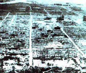
The above are examples of the sort of images I plan to place onto the structure. It can be seen immediately that these two images are very contradictory, and as a combination, quite shocking too. The first is a landscape photograph of a field (possibly used for farming) on a bright sunny day. It is in colour and uses very bright and vivid yellows, with greens and blues. The second is that of Hiroshima, Japan after the dropping of the atomic bomb, wiping out life for miles around with not much left standing. This is also a landscape, although a little more horrific. Unlike the previous image, it is in black and white, and due to the subject of the photograph, very bland and lifeless.
Although it is intended to be shocking whatever order you see the images in, it must be said that to see the field before the image of Hiroshima is probably more shocking. Also due to again the subject of the second photo - that of Hiroshima, without explanation it may be hard to recognise what the image is depicting.
However, as I mentioned before, these are only examples of the sort of images I plan to use. Due to copyright issues, I would need to obtain permission from the authors of the photos before using them. This may be cause problems if either they cannot be contacted, or they do not allow their images to be used. In that case alternatives would need to be found.
Placing the images on the structure
To place the images on the structure I would first need to enlarge them and then find a way of printing them onto the surface. To produce enlarged colour photographs would be expensive, so I considered other methods such as silk screen printing the images onto strips of fabric and stretching them over a frame. However with light possibly showing through and due to the nature of the fabric, I decided the images really need to be placed on a solid surface. The method I would probably use (although this hasn't been tested) would be to copy the images onto acetate and then project them on to wooden panels. The images could be traced and then painted directly onto the wood. The panels would then be varnished in order to waterproof them.
Materials & Costing
I plan to construct the piece out of wood, of which I considered the following types:
- MDF
- The cheapest of all the considered types. However, due to possible health hazards, MDF is banned from use within the college and so it wouldn't be possible to build the structure from this material on college grounds.
- Chipboard
- Expensive and quite weighty. Also it comes 'as is' and can't really be sanded down or have a nice finish applied to it.
-
- 12mm x 8' x 4': £6.99 per sheet
- 18mm x 8' x 4': £9.99 per sheet
- Hardboard
- Fairly cheap, lightweight with one side smoothly finished, which is perfect for painting on.
-
- 3.2mm x 8' x 4': £3.75 per sheet
I finally decided on hardboard as it was the most suitable.
Working out (approximately) the sort of size I would like to produce the piece of work - a structure that spanned an area about 12' x 6', I have worked out that I would need about three sheets of 8' x 4' hardboard. This would work out to be £11.25. What with additional costs in it's construction, it would work out costing around £20 - £25 to build in total. Other costs may arise in obtaining permission for use of images and so this should also be considered in the total amount.
Location and Installation
I looked at a variety of sites for where I could install my work. I was looking for areas in which the most people would be passing in both directions, be able to see it and also an area in which the piece could be easily installed:
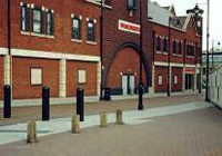
Walsall College of Art and Technology
 This is an area which would be quite easy to obtain permission for installing my work. However, apart from people waiting for their buses, the area is never really that bustling with people. It is however an area used by a large number of students.
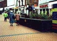
Town Wharf / Townend
 This location is close to the new art gallery and, considering it would be installed at the time of its opening, this area is likely to be quite busy.
However if I was to choose this location, the best place to install my work would be against the wall of Woolworth's. To stop it from falling over it would have to be secured probably involving drilling into the wall and I doubt very much that I would be able to obtain permission to do this.
Also, it is quite likely that it would only be viewed from one direction - that of Park Street.
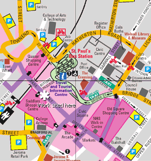
Final Location: Section of raised flower bed - Park Street
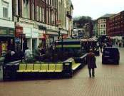
After considering the various locations, I decided upon a section of raised flower bed in the centre of Park Street. Being the main shopping area in Walsall, it would be seen by a large number of people, many of which would be passing in both directions. It is hoped that they would notice the contradiction between the image they first saw and the second one. Also, planted in the flower bed, are three sign posts, two of which I could use to fix my work securely. Another advantage is that it would be high enough for people to notice it, but also the right height for it to be viewed properly.
Out of the Blue
My (shortlisted) proposal for an exhibition piece to celebrate the opening of Walsall's New Art Gallery in 1999.