Dissertation
4. News Presentation
4.2 Branding News
Although all the BBC's news programmes contained similar elements and musical scores however, there was no consistent branding across the programmes. With each having its own editorial staff and personality meant graphics had to be drawn many times, following different styles and conventions used for each bulletin.
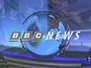
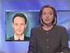
As a measure of cost cutting, as well as bringing the benefits of a single united brand, all news output was unified in 1994. The centre piece of this new unity was a 'virtual studio' that was almost completely computer generated and was the main feature of programmes titles. For these a virtual glass pane depicting the BBC's coat of arms was set in the foreground, with the news desk in the background with studio lights above lighting it. The start of the bulletins now began with the BBC logo alongside the word NEWS, as to create a separate brand from that of the BBC.
The music from the individual bulletins was retained though, but updated and modified to fit in with the new presentation style, and individual bulletins used different window keys (the graphics shown behind the presenters showing an image relating to the current news item).
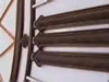
The sets background also varied its colour through the course of the day - starting with light pinks and blues at breakfast, darkening through the day to dark blues and oranges for the Nine O'clock bulletin, reflecting the time of day (figure 4.2a)
Figure 4.2a
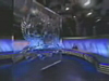
The BBC's virtual news studio took pride of place at the start of its bulletins. Shown above are the window keys for One O'clock and Six O'clock bulletins - all bulletins keeping some aspects of individuality.
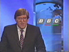
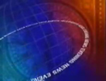
ITN followed suit a few years later with a generic brand again designed by Lambie-Nairn. An original ITN logo from the 1970's was brought back into use (the current incarnation having been heavily tampered with by computer using chrome and three-dimensional shadowing), and other familiar elements from ITN's visual heritage such as the shot of Big Ben and the 'bongs' were used for all its programmes.
New titles were created which exclusively featured the clock face of Big Ben, with close up shots before pulling away to show the appointed hour (figure 4.2b). Thirteen differently lit versions were shot to reflect the time of day and the changing seasons. As for the set:
Our belief was that a news programme should communicate honesty, transparency and plain dealing... ITN's new Grays Inn Road building provided us with a marvelous opportunity to get this impression across.'
(Lambie-Nairn, 1997, p207)
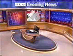
The modern building nearly all of glass provided the backdrop for all ITN's bulletins, with modifications only needed to prevent reflection and allow the set to be undisturbed by weather conditions.
Figure 4.2b
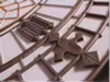
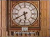
The clock face of Big Ben was at the start of every ITN bulletin from 1996.
In 1999 however, news programmes on ITV, like those on Channels 4 and 5, no longer used the ITN name or branding, and used the ITV name instead - reinforcing this brand rather than ITN's own. (figure 4.2c)
Figure 4.2c
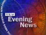
As provider of news to ITV, ITN were forced to remove all it's name and branding, using a separate 'ITV News' name. This was to re-enforce ITV's brand further, rather than ITN's.
Up until the launch of Channel 5 in 1997 and its news offering '5 News', the actual presentation of news had remained much the same. Aimed at a younger and perhaps less news-interested audience, and with a more tabloid agenda, it was set in a bright and colourful newsroom and involved the anchor sitting on a desk rather than behind one. Individual reporters for different sections of news (i.e. politics and sport) had their own sections of the set in which souvenirs and mementos were set onto shelves (politics having three mugs from each of the main parties, rosettes, pictures of MPs etc. whilst sport had a football, scarves and other memorabilia).
This was radically different to anything that had been seen on television in the UK before, and was loosely based on a news programme from Canada. Its title sequence had a fast pace matched by it's musical score, bright colours and quick cuts between news type images (figure 4.2d)
Figure 4.2d - 5 News


Channel 5's fast paced and colourful titles, as well as it's presentation style, were to change the face of television news in the years to come.
Although Channel 5 News has never challenged its better established rivals in the ratings, its colourful breezy approach to explaining stories to its viewers prompted changes to Newsnight, BBC1's bulletins and Channel 4 News.
(Gibson, 1999)
The first to change was Channel 4 News, and although this time the anchors were sitting, they were sat next to low level desks, meaning you could see what colour socks Jon Snow wore! It's set and titles used bright colours, but not in such an overbearing way as in '5 News' - made more somber with a heavy use of black. The set also featured a large video wall, in which the anchor or reporter could stand in front off whilst graphics were displayed behind them.
The BBC similarly followed also with the use of a large plasma screen in which a correspondent could stand in front of to help explain his or her item, but this was introduced as part of wider transformation to the look of the news across the whole of the BBC. As mentioned before, the BBC now used the same graphics package and set for its main bulletins on BBC1, but now with a 24-hour news operation (both in the UK and globally) and an online news site, BBC News as a brand didn't really exist. Furthermore, it's regional news programmes were seen as second division against the national news bulletins.
Once again, Lambie-Nairn was chosen to essentially create an identity for all of BBC's news output and develop a brand that would re-assert its position on the British news landscape, and echo the values of 'truth well told'. This was done with the creation of a set of similar elements - concentric radiating circles in the style of transmitting signals, globes, maps and clock faces as well as a consistent use of type, giving the brand consistency yet flexibility across its many different applications. BBC News was also given a proprietary colour palette of Ivory and China Red (news programmes often use blue) which meant its presentation had a much warmer and approachable feel.
The main bulletins on BBC1 shared similar but varied titles in which maps of first Britain then the world interacted alongside the spelling out of major capitals, overlaid with clock hands, radiating rings and globes. Towards the end of the sequence the hour of the programme (be it 1, 6, 9 and later 10) were brought in, spinning on their axis before resting in a straight position. BBC News 24 and BBC World (the BBC's 24-hour rolling news channels) continued these themes - with News 24's graphics package having a closer resemblance to those titles seen on the BBC's domestic output.
As for the BBC's regions, they again took the BBC News elements, whilst adjusting their colours - the English regions used oranges, yellows and light blue for example - and adding local elements such as map shapes and place names. All this was to increase viewers to the regional programmes - the use of similar elements aimed to put across the message that the viewers were essentially watching the same programme form the same people.
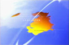
Again the main bulletins on BBC1 shared the same set, with the nations and regions using similar sets based on the same themes. Even the 24-hour news channels borrowed elements, creating one unified brand across every area of it's presentation. Music again followed the 'same but different' theme, using upbeat yet punchy scores based on the famous beeps heard on radio to mark the hour. (figures 4.2e, 4.2f and 4.2g)
Figure 4.2d


The new BBC News brand used similar elements for all its news bulletins.
Figure 4.2e
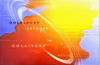
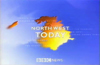
These were echoed in regional news programmes.
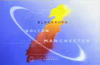
Figure 4.2f

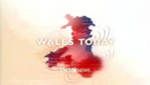

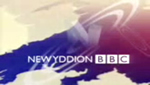

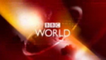
The BBC News brand extended to all regional and national output, even for the news it provides the Welsh forth channel S4C. BBC News 24 and BBC World, the corporations 24 hour rolling news channels, also carried the branding.
Dissertation
My degree dissertation, submitted June 2002.
1. The Visuality of TV
2. What Went Before?
3. The Growth of Branding
4. News Presentation
Conclusion
Read Offline
- Print Version (PDF)
- The full submitted text.
- Requires Acrobat Reader
Shop with Amazon.co.uk
- Brand Identity for Television
- Lambie-Nairn