Dissertation
2. What went before?
2.1 Early Graphic Design in Television
Television in the United Kingdom for a large part of its history consisted of three channels run by two networks - the BBC (British Broadcasting Corporation) and ITV (Independent Television). The BBC was the world's first television service dating as far back as 1936 - a public service paid for by a licence fee. ITV followed in 1955 with a network of regional television companies that unlike the BBC was a commercial service supported by advertising.
This was a comfortable duopoly, where each network competed through its programming, meaning a lack of consideration and under investment in graphic design for much of televisions early history. In fact it wasn't until 1953 that the BBC appointed Richard Levin as its first Head of Design, who quickly realised the need for a graphic designer. A year later, and almost 20 years after its first broadcast, the BBC employed its first full-time graphic designer - John Sewell, and even then this position was under the control of Scenic Design. It was probably no coincidence that independent television was being established at this time, meaning an end to the BBC's long standing monopoly. Up until this time, sign writers and commercial artists met most of televisions graphic needs.
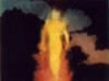
The quality of television broadcasts at this time were crude to say the least. Limited to black and white and with a low resolution, television was worsened by the quality of the receivers that tended to suffer from poor definition. Furthermore 20 percent of the screen was considered unusable due a lack of focus around the screens edge, and different television sets cropped the picture at different points. This restricted the graphic designer somewhat and resulted in large and bold lettering with strong tonal contrast, and illustrations with heavy lines and little detail. It's not surprising that 'op'and 'pop'art themes were in common use throughout the fifties. (figures 2.1a, 2.1b)
Figure 2.1a - Stills showing the graphic style of television during the 1950's.

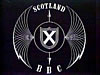
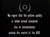
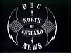
The left two show idents for the BBC and the BBC in Scotland, the third still is an apology caption typical of this period, and the forth shows a typical (non-animated) ident for a news programme in the North of England.
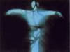
Figure 2.1b - Two sets of titles from programmes dating from the 1950's


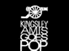

'Kingsley Amis Goes Pop' (Associated Rediffusion, Early 1950's, Designed by John Tribe)


Bottom: 'Wednesday Magazine'(BBC 1958, Designed by Bernard Lodge)
The launch of BBC2 in 1964 saw the introduction of 625-line higher resolution broadcasts and three years later colour, both of great benefit to the designer although not straight away. BBC1 and ITV only began colour broadcasts in 1969 and the improved 625-line transmissions were still broadcast alongside those using 405-lines, which even with their low quality, weren't suspended until early 1985. It was up to the audience to upgrade their sets, and sales of colour receivers were unexpectedly low when colour television broadcasts began. Before the majority of viewers had 625-line colour receivers, the designer still had to consider those watching on older sets. However, typical graphic design during the sixties saw a greater use of photography, more detailed illustration and a more apparent use of calligraphy. (figure 2.1c)
Figure 2.1c - Titles dating from the 60's and 70's involved a greater use of photography and colour.
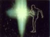
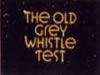
'The Old Grey Whistle Test' (BBC 1968, Designed by Roger Ferrin)


Bottom: 'I, Claudius' (BBC 1976, Designed by Richard Bailey)
Graphic design was also starting to become more automated with an increasing knowledge of the effects a film rostrum camera could achieve. This was a vertically mounted camera that was able to move up and down above a bench on which artwork was placed, the bench providing the majority of the movement. Used mostly during the filming of animated title sequences, it was also used for filming compilations of stills (photographs, paintings or prepared artwork) and shooting cells a frame at a time ready for animation. Later computers became involved in order to control the rostrum camera and allowed complicated moves and techniques such as 'slit-scan' and 'streak-timing'to be achieved.
The 1980's saw the introduction of digital paint systems such as the Quantel Paintbox, enabling the graphic designer to assemble collages and montages as well as adapt images. Lettering, first drawn by hand, later using Letraset and character generators, could now be composed in a mater of seconds. The computer had become so versatile, that it could even be used to create whole title sequences or station promotions - green monitor output and wire frame graphics being extremely fashionable at the start of the decade.
Dissertation
My degree dissertation, submitted June 2002.
1. The Visuality of TV
2. What Went Before?
3. The Growth of Branding
4. News Presentation
Conclusion
Read Offline
- Print Version (PDF)
- The full submitted text.
- Requires Acrobat Reader
Shop with Amazon.co.uk
- Brand Identity for Television
- Lambie-Nairn