Dissertation
3. The Growth of Branding
3.1 ITV and BBC - First Attempts
As in other areas of contemporary marketing, the idea of 'the brand' replaced older models of production and sales. Television companies saw a key role in the development of brands as having identities that were different to competitors which could be recognised and valued by their target audiences.
The first real attempt to create a brand to rival Channel 4's came in 1989 when the Independent Television Association decided to create a new ITV corporate brand for it's fragmented network, that would at the same time give a consistent image across its regions with a stylish and meaningful design.
English Markell Pockett had to come up with a new logo that could incorporate fifteen regional variations into a single corporate image to counter the strong national images of new satellite stations like BSB
(McClellan, 1990)
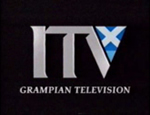
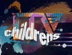
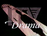
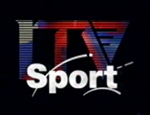
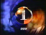
This was achieved by developing a generic ITV logo alongside regional variations where the 'V' was changed from a blue triangle with three cut outs, to highly stylised, almost heraldic imagery, loosely based on each regions own logo. A single but regionally adapted ident was created alongside a musical score composed by the same man responsible for Channel 4's - David Dundas. This was played as a regions logo was stretched and blurred sideways to launch into an animation featuring images of Big Ben (representing current affairs and politics), dancers (entertainment), a couple in an embrace (drama), an athlete (sport) etc. before recombining to show the appropriate regionally adapted ITV logo (figure 3.1a). Theme specific identities were also created for sport, drama and children's programming. Although a nice idea in theory, some regions refused to use these idents and for those who did, it wasn't long before many adapted them to suit their own tastes. To accept the common logo and identity was seen to be dubbing down their own for which was relied on as a link with their viewers. Furthermore, 1992 saw three regions lose their franchises, and those that replaced them launched with their own idents.
Figure 3.1a - ITV's 1989 Rebrand
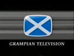
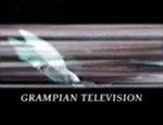
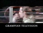
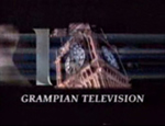
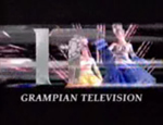
Example of how the generic ITV animation worked within the regions, here as seen in the Grampian region
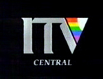
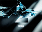
The generic ITV logo, shown alongside regional and genre variations.
With both Channel 4 and ITV having modern idents, the BBC's two channels were starting to look outdated and dull. The BBC has a special place in broadcasting, as it does in the nations cultural fabric (sometimes affectionately referred to as 'Auntie' Beeb).
Being a public television service paid for by the people and so not littered with advertising, as well as an institution with a rich history entwined with the nations, it is seen as impartial and trustworthy, innovative and the gold-standard in television. The image it projects is in some ways, a reflection of us and our country and this importance means it has an image that is not to be meddled with lightly.
Whilst BBC1's slightly wooden and stayed 'COW' ident was popular, BBC2's hadn't managed to keep pace with the changing programming of the channel and was perceived as boring and snobbish - summed up with a predominately grey ident. Furthermore, the two channels had no consistency between them or any of their own promotions, and their identities didn't transfer well to print.
In 1990, Martin Lambie-Nairn - a former employee of the BBC's in-house graphics department during the 1960's - was brought in to refresh the identities of both channels.
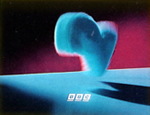
The identity for BBC1 retained a globe as the central element, reminding viewers of the BBC's self-appointed role as a kind of super-national messenger
(Aldersey-Williams, 1993)
The new ident was given a more contemporary feel making it more colourful, warmer and gave it an almost mystical quality. Designed by Daniel Barber, the new globe was created by lighting model globes from different positions and resulted in a swirling one minute sequence with nine different looking points of entry.
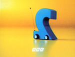
For BBC2, Lambie-Nairn used a far more radical approach by creating a family of idents based on the numeral 2 (hand drawn but based loosely on the Gill Sans 2) which used a viridian colour branding. The family included idents that could be programme specific, and some that were purposely aired on an occasional basis to give them air of rarity. To give BBC2 more credibility, BBC1 was also given a numeral, although more classically styled. By doing so each channel mutually supported each other.
Whilst BBC1's image was designed to endure and remain graphically appealing, BBC2's identity would be developed over time. Consistency was also brought to each channel, with all promotional material carrying the channel logos in fixed positions on screen, and all other information such as programme start times, menus, apologies etc. set in the Futura typeface (figure 3.1b)
Figure 3.1b - A new consistent image for the BBC in 1991
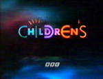
Branding was consistent across both channels and it's children's programming.
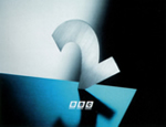
BBC2 had a variety of idents that were added to over the following years.
After what Lambie-Nairn described as a 'repositioning'of the two channels, both were seen as more up-to-date and accessible, without destroying BBC1's already strong image. The BBC2 identities became a particular hit, both with the public and within the design industry. With no change to it's programming, BBC2 was now seen as sophisticated, witty and entertaining. The '2' figure was developed further over the following years with idents such as 'Fluffy Dog' in which an excitable figure two leaps into the air and summersaults, and 'Car' in which the 2 becomes a remote controlled car that whizzes around the screen, both becoming firm favourites with the audience. Alan Yentob, controller of BBC2 at the time, was quoted as saying:
It has received lots of fan mail and correspondence. We will definitely be renewing its contract.
(Lambie-Nairn, 1997, p122)
Indeed 11 years since they were first aired, the 2's can still be seen onscreen, albeit recently updated.
Within two years, the face of television in the UK was now akin to that of a supermarket shelf with the viewer able to chose from three separate yet distinct brands. Whilst BBC's 1 and 2 now had a consistency between them, BBC1 still maintained it's sense of quality, whilst BBC2 had a flexible yet familiar identity more appropriate to its changeable programming. ITV had a new corporate personality and (some) consistency across the regions, yet kept its popular programming outlook, and Channel 4's identity - unchanged for 10 years was still appropriate and popular. Whilst BBC1 relied on its familiar globe identity, backed by variations of the '1' numeral for seasonal and programme promotions, ITV had to seemingly remind its viewers what it strengths were as a channel within its idents (most programme promotion was dependent upon region).
Whilst the flagship channels had dark idents with subtle hints of colour, BBC2 and Channel 4 clearly became slightly alternative viewing matched with two colourful figures competing against each other for wit and personality (BBC2's being a more modern treatment) and both figures had the flexibility to match the varied programming of each channel.
Dissertation
My degree dissertation, submitted June 2002.
1. The Visuality of TV
2. What Went Before?
3. The Growth of Branding
4. News Presentation
Conclusion
Read Offline
- Print Version (PDF)
- The full submitted text.
- Requires Acrobat Reader
Shop with Amazon.co.uk
- Brand Identity for Television
- Lambie-Nairn