So Monday saw the much anticipated reveal of the most significant identity to launch in Britain since that of the Millennium Experience in 1999. My immediate action upon seeing it was one of restrained joy - it was great to see something new in a category of identities that have remained pretty conservative and predictable over the last 40 years.
However as I look at this identity more, it quickly becomes obvious that it has a number weaknesses as well as strengths. Yet sadly the proper debate about the relative merits of this logo have been sidelined by the usual sensationalist journalism that we have come to expect in Britain.
Fellow Multipacker Andy Higgs had this to say about the new design:
Although I think popularity around this will grow in the short term, (or indifference will culture) this was a bad decision, too risky, and possibly heading to be the appropriately lasting icon of a publicly-funded financial sieve.
I’ve been meaning to write about this since the announcement, but Andy’s post spurred me into writing a response on his blog, some of it I will echo here. To me, his post worried me, as it seems that people opinions are being cast without the due diligence such an identity deserves. Personally I have mixed thoughts, which I will talk about in a moment, but first I want to talk about the medias response.
The response
When it comes to matters of design, the mainstream press seems to have a very sensationalist approach, and always seem able to provide the same two arguments: It costs too much and and we didn’t need a re-brand in the first place. Let me tackle both of these issues head-on.
It’s an unnecessary re-brand
Correction - this is not a re-brand. This is a logo for an Olympic Games - used to promote the event, it’s ideals and to give it it’s own unique identity amongst previous and future games. Outside of the great sporting moments that will hopefully take place during the two weeks, this icon will in time become a signature underlining the games and the events that took place.
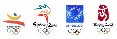
The Olympics have always been closely associated with the arts as well, so the logo is a great place to start if you want to add a design stamp on the games. In fact the games of Mexico in 1968 and Munich in 1972, still have relevance today in design circles as they set trends and pushed the boundaries in both identity and information design.
This mark is of the Olympics as they will be in 2012, and of what they were in 2012. This mark has to sell, and then it has to last. A pretty tall order.
The previous logo was that of the bidding process. It’s competitors were the other candidate cities, and the identity was to promote the city, and it’s ability to host an Olympic games.
Those two goals are entirely different, and in this brand centric world having such different needs requires two entirely different identities. Believe me, I’d be the first have that not be the case, but brands are now our masters, and they need to work.
It cost too much (£400,000)
I always love this argument. Sometimes it’s true, but usually it’s complete tosh. It feels great to have your profession devalued so easily by those who have no understanding of it.
I ask you, what if it this cost half the amount? What if it cost £20,000? Would people still be complaining that the cost was too high? Of course they would, as it’s a great angle (an all too easy, journalistically lazy angle) on a story. How about an actual intellectually informed critique of the good and bad aspects of this logo, it’s strengths and weaknesses, and then perhaps if you think that it doesn’t perform as it should, then complain about it’s cost.
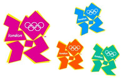
Note also how everybody has published the pink and yellow version of the logo, opposed to the more conservative colour options. Why? Because it’s easier to generate a reaction, and thus sell papers.
As I’ve already stated, this identity has a lot of work to do. Not only has it got to stay in peoples imagination for six whole years, it then has to work as a part of a legacy (and hopefully a good one at that).
It ammuses me that the BBC put together a gallery of user submitted entries (all of which were incredibly bad), and then promotes it as a way of suggesting anybody could design the logo. Are they really suggesting that if one of those was the selected logo of the games, they could stand by it. Please.
Also ammusing are the comments that this looks like the Nazi Swastika. It’s great to see that Godwin’s Law has yet to be proven wrong.
The Epilepsy Debacle
I also want to quickly touch upon the issue of the promotional film. From what I’ve read, before it was played at the launch event, it was preceded with a warning that it was not safe to to be viewed by epileptics. Broadcasters then went on to replay it without this required warning.
As I see it, this is an issue with the television companies, not LOCOG, or Wolff Olins. But now that the anti-logo bandwaggon is in full swing, we’ll see the cheap headlines like ‘Logo causes epileptic fits’. The fact is that the logo has very little to do with this at all. (I should also add that I think this promotional film is the weakest part of this identity, and I just hope that as the brand ‘evolves’ that something a bit more original can be thought up).
It upsets me that the British media always falls into the same trap. This is our showcase to the world, yet once again we’ve demonstrated, that whilst we can come up with great ideas and something new, we always become downbeat and then inwardly criticise ourselves. It’s the predictable build it up, knock it down agenda, and it’s upsetting to see this constantly played out in the media. I’d just like to see an honest discourse for a change.
The Identity
As I mentioned in my introduction, I was actually pleased to see this logo when I first clapped eyes on it on Monday. My initial happiness, and also pride, was in seeing something that immediately changes the rules of what constitutes an identity for Olympic Games, and perhaps the wider expectations of what a logo should look like too. I think we can safely assume that future logos for games and candidate cities will certainly become a lot less conservative.
Previous logos have had very similar designs
I can’t tell you how relived I am to not see a stylised flame, Big Ben, or an athlete, in red, white and blue. If we ended up with an identity like that, maybe the press would have been pleased, but our mark on Olympic history would quickly have been forgotten, if we were to make a mark at all.
Whilst this doesn’t immediately say ‘Britain’, or ‘athleticism’, I think on a more subtle level it does. Firstly Britain is well renowned as a nation of innovation and design, and those are certainly aspects we should promote in an identity of this nature. As to athleticism, it does have a certain energy about it.
Often those designs that create the most outcry, are those that tend to last, as well as become incredibly popular.
Think of the iMac, the Ford Sierra - two product designs that immediately come to mind, both of which had daring designs and were criticised at launch. But both went on to outlive their shelf lives as their designs proved to be popular.
People don’t like change, but what is life without it?
Coudal Partners came up with ten reasons why this identity should be applauded (it’s simple, it’s not boring, it’s timeless, and on a more practical level reasons such as it’s easy to reproduce, and can form the basis for a graphic system). I would add to that another benefit: it’s internationalised (the design requires no translated versions). The argument that this cost too much is looking ever more stupid.
But there are issues, and some pretty big ones at that.
Whilst I like the idea of using the date 2012 (the first twenty-something event in peoples minds, so already it sticks out), it took me a number of takes to realise this. I’ve also seen commentators ask why there is a hyphen between 20 - 12, but on closer examination I believe that to be part of the 2 - but I’m only guessing.
Not least of it’s problems are that it’s been designed to appeal to children, teenagers; or ‘da yoff’, but this design seems incredibly obvious in that respect. It’s a bit like your grandparents wearing trainers and a baseball cap, or the Presidential candidates having MySpace pages - the target audience sees straight though it, the net result being your brand is seen as ‘sad’ rather than ‘cool’. I think there is a real chance this identity will be rejected by those it’s being aimed at.
Unfortunately, this is the mark of a Wolff Olins identity - whilst strong, they always fall into the obvious category - Orange (the word orange in an orange box), BT (a piper stylised with flashes of the Union Flag) - I could go on. I’m not a massive fan of this agency, and whilst I applaud their braveness, I’m saddened by the obviousness of their outcome.
Conclusion
So right now, as I come to terms with this design, I’m torn. On the one hand I’m really glad to see the organising committee show braveness, and actively try to look upon the opportunity provided by a London hosted games with fresh thinking.
At the same time, I’m slightly shocked by the outcome, but not for it’s design, but for it being so glaringly obvious. It seems to me they were about 3 revisions away from a great idea, yet instead we’ve ended up with something that alienates both it’s intended target, and perhaps the rest of us too.
 LloydyWeb is the home of
Comments
21 responses so far. Go on, add yours!
Still looks like Lisa Simpson going down on someone to me.
Paul,
Hope this does not effect our friendship but I can't help disagree with at least the first half of your post. Your analysis of the design is the very type of clap trap that people have come to expect from you designer types. It doesn't take any kind of technical or trained development analysis skills to realize what they have come up with is just a piece of crap. People know a good design when they see one and this is definitely not one of them no matter how you analyze it. See Paul, what you have to realize is that the masses of the population are not developers or designers and have no training on the relevant subject that 1, allows them to appreciate this logo or 2 come up with this crap in the first place (unless you are a primary school student). After seeing the logo for the first time, I thought it was ugly and a mess, I didn’t even realize until looking at it for a while that the squiggles were the numbers 201.2. Upon reading across the net, this seems to be the general consensus.
It’s also funny that you criticize the BBC and it’s user created logo’s, yet, I wonder if put to a vote, the public would choose of the user created designs (which cost nothing) over the £400,000 disaster that exists now. (I know I would)
In regards to your comments on the change and advancement in design, since when did the Olympics represent change and advancement. The most common and popular events are those based on centuries old spots and competitions (track & field sports etc.) I mean come on, we all know how the Olympics is already going to end. The public will get behind England and expect them to win even though their performance will be disappointing, The USA will probably win closely followed by Russia and Australia and some women from Africa will win the 10000000 meter run. So why the need for such a radical change in the logo? Will I watch the Olympics? Yeah sure, it’s like watching the World Cup every 4 years, you know how it’s going to end up, but you hope and watch anyway.
I guess this might be a wake up call for the designers of the world, step out of your own world and visit the real world where the rest of the people live. Then come up with a design that they may like, which after all, the design is for the people and the generation of the people, not an elitist group of designers.
Phill
Hi mate,
I got back to you on my post again...
Loving the passion!
Andy.
Putting the particular merits of this logo aside, people instinctively react negatively when faced with experimental or unfamiliar visual language. But it is precisely this inability to quickly and comfortably grasp the meaning of something that keeps it lingering in our minds. An effective logo is not pleasant and comfortable, it is memorable.
As a non developer, I do not understand how having a logo that is widely believed to be ugly, unrepresentative, and a waste of money can be good for any brand. Having a logo which is memorable for being shite in my opinion is a bad thing.
Where is it that designers are taught that it doesn't matter if it's bad design as long as it’s memorable? I just don't know how that would fly in any other profession, for example.
"It doesn't matter if your coding is really bad as long as people can see it crashing".
I guess designers and the rest of the world see 2 different things when they look at this logo which further backs up the point I made in my previous post.
I wouldn't have cared if the logo was ultra modern, futuristic, and daring if they had given something that looked meaningful and at least like they put some effort into it. All they did was mess up the numbers 2012 and add some lettering inside. It really is some god awful thing I could have come up with at primary school and got a D for effort.
The truth is though, the masses have already spoken and they think the logo is bad. How can so many people be wrong? People know a good design when they see one and this is not one of them (and people will put up with a lot of crap (have you ever watched changing rooms?)).
Despite all this, non of the commentary matters because in typical British fashion, they won't fix it, they will continue to fly in the opposition of public opinion. Think Tony Blair on Europe or Fuel prices etc... Again England has a golden opportunity to do really good on something and they are just going to screw it up, just wait and see! Better start building those stadiums early cause we all know they'll be a year late finishing them!
Yes the glass is definitely half empty on this one because if you can keep a smile on your face when everyone else can see Lisa Simpson giving a blowjob or, as I have observed, a woman eating scat. Things are definitely heading for the toilet.
Phill
Phill, it really seems that you are playing devils advocate here. Let me try and respond to you many causes for concern, one by one:
I actually think designers (or probably more precisely the marketing men and press offices) don't do themselves any favours when most identities are launched alongside a bunch of hyperbole, which everybody can always see straight through (including other designers). I'm all for ending this sort of behaviour, but it will continue for as long as design consultants feel they need to provide such superlatives to their clients.
I read the identity focused blog Brand New, and Tony Spaeth's well respected site Identity Works. In their reviews of new identity programmes and marks, this almost always involves dissecting the 'clap trap' that it launched with, and asking what was really trying to be achieved with the design. So this is an area that frustrates both those inside and outside of the profession, and I couldn't agree more with you that this sort of thing sucks.
As a point of reference, I was at a conference in April, and one of the presentations was by ad executive William Rosen from Leo Burnett. His talk was stuffed start to end with all the keywords you would expect from somebody in advertising: 'consumer engagement', 'value exchange', 'connecting with a brand'… I can't tell you how annoyed I was by this, as it's all bullshit. I'm off the mind if you want to direct your anger, then direct it at the marketeers (all mouth), not the designers (all action).
As to your own thoughts about the logo, that's fine, but please don't start classing everyone in the profession as if they are all self-obsessed morons, as frankly that just isn't the case, and quite unfair to those who actually are trying to be honest.
Okay, so lets look at the designs. The very first example shown included a modified Olympic rings - you can't modify that emblem in any way shape or form, so this (and other such designs) are not an option. Next.
Logo's that depict famous London landmarks. What these have to do with an international sporting event I really don't know. Add to this the designs that incorporate design elements from the London Underground. Next.
The Olympic rings atop of a map of London which is super-empossed with the Union Flag. To this, and the many other logos that follow the Union Flag or red, white and blue theme, I ask at what point is the nationality of the host important in an internationally focused event.
Tell me which previous Olympic logos have been draped in national colours. Not Bejing. Not Sydney. Not Barcelona. Not Seoul. True Los Angeles in 1984 used the star emblem (which could be considered an American reference) and more recently the Athens logo was blue and white, but these are exceptions to the rule.
It is in fact far more common practice to take the colours of the Olympic rings (whose colours were chosen such that each nation had at least one of these colors in their national flag), than to go all out patriotic on the events logo. Frankly this would say something quite disturbing about how Britain sees itself if this was chosen.
You know, it's for these reasons, that sometimes designs are best not left to a public vote.
I think I was talking more about the design that surrounds an Olympic games than the movement per se, but regardless, if that is the case, are you saying that this should remain the case. Are you in essence saying if it's broken don't fix it?
Just because this is new, and you are not comfortable with it (and also understand that it's primary audience is those who are much younger than ourselves), don't try and reason your argument by saying those who designed it are elitist. Whilst this identity might not connect with you, don't assume this has something to do with the English class system!
Also remember that this design is for the people, but not just of London, not just of Britain, but of those across the world, and of all ages too.
Apple - All the did was draw an Apple with a bite taken out of it
McDonald's - All they did was put two yellow arches into the shape of an M
Nike - All they did was draw a tick shape.
Shell - All they did was draw a shell.
BBC - All they did was place the letters BBC into three boxes.
You see where I'm going here? Sometimes, simplicity and obviousness are what make great identities great.
People also don't like change, but once they get used to it, and get over their initial shock, sometimes they actually come to appreciate it.
I was looking at an image of the old Ford Scorpio yesterday (you know the one with the really big front grill) and I remember how much I hated and laughed at that design. Take a look at a Mercedes or a lot of other car designs today, and you can see how that design doesn't actually seem so bizarre nowadays, and was in fact just ahead of its time.
Sometimes you need a design to make a quantum leap, to change people perceptions, and try something new. Usually the first to attempt this will fail (and that could very well happen here), but it will certainly lay the foundation for future identities to try something similar, and they will no doubt be successful (the shock having already happened).
I ask you to come back in 2012 and tell me what you think about the logo then, when it has become part of your consciousness, and perhaps a little common place. You may still feel the same (I'm sure I will still be annoyed by the final '2' not being joined up), but you come to appreciate it for what it is. We don't know if we don't give it a chance.
I hope they don't change it, and in fact I'm scared that they will bow to public pressure. That would be so incredibly damaging to Britain's reputation, of which obviously you can't see.
Not only that it would give even more power to an increasingly powerful press (half of which is owned by one or two individuals), it would show Britain as weak, not strong nation of people who are scared of indifference, and aren't happy unless a logo has the Union Flag slapped across it (and that's how it feels right now).
There is also a difference between 'public opinion' and what the press perceives (or indeed actively promotes) to be 'public opinion'. Much as there is a difference between asking somebody 'what are your thoughts about this logo' and 'do you think this logo looks hideous'. They call this a leading question.
As to your other comments, about the organising committees ability to deliver on schedule, and whether the Olympics are any good or not, those are entirely different arguments. Don't for one minute assume because I applaud the new brand I agree with how the organisation is being run (people thrown out of their houses, compulsory purchase orders, small businesses being displaced etc).
Indeed there is a lot more important issues surrounding the London Olympics that actually effect peoples lives that are being totally ignored by the media. But these issues don't sell papers…
Anyway, by now I'm sure the journalists have moved on from this issue, and from what I'm hearing, they are now back to covering Big Brother. And therein lies a much bigger problem.
Paul,
Ok after reading your post I guess a lot of my criticism of this logo was misdirected at designers rather than ad executives for which I apologize.
I am not sure why I have such a problem with this logo except that when I first saw it, I thought it was crap. Given the money involved, I would have thought they could have come up with a better looking logo given that I really did come up with these kind of designs as a school student (I expect better than what I could produce myself).
I wonder why they didn’t have an alternative logo or revision, how did it come down to “YES, we have the logo!” The 2012 numbers are hardly even legible / recognizable. This is something that I have learned to avoid in any artwork which I produce (at least make sure people can read the script).
So for all my ranting, I will quit for now (until 2012) when I will reassess the logo. However, I will point out that I am not afraid of new designs, I am a big fan of modern logo designs and font types, I just don’t believe the Olympic logo is fits this category and by analyzing it any further on these merits, I run the risk of sounding like an Ad-Exec myself.
But before I do leave this subject, I will offer you a chance to criticize my own art work. however, a little background info first.
I am NOT a designer, nor am I a web developer, I am a programmer who works mainly with SQL databases and application design. I used to work for computer repair company in Midland, Texas, a predominantly conservative town. The company had recently been purchased by a new owner who wanted to grow the business and become more profitable. However, the brand and website represented a small time company who had little concept for design or branding. The main company logo consisted of the words Computer Concerns in a Times New Roman type font in red (not very imaginative). The company tasked a marketing company to design a new logo for us. After 3 rounds of concept drawings the company decided to stop wasting money and leave the subject for a while. I decided that it couldn’t be that difficult to design a logo and went to the web in search of inspiration. After about 10 minutes, I had a design which was instantly approved and is used on the Computer Concerns website which you can view here (www.computerconcerns.com)
I did not design the website, it was a template which was purchased and used by the web designer. I welcome your criticism.
Phill
I like that computer concerns logo a lot! Its simple, clear, concise, memorable and it looks good! Everything a logo should be!
The Olympic logo, while I don't completely hate it! Is a bit of an over complicated mess!
While I understand a lot of points that you made in your argument Paul. The fact remains that in the world of design, much like the world of art, literature, poetry etc.... is that there is no definitive way of judging right and wrong and the only measure we have is the opinions of the majority.
Vincent Van Gogh was a very famous artist as an awful lot of people liked his paintings, and Shakespeare was a famous play writer as an awful lot of people enjoyed his plays. But there is no scale that we can measure these two individuals on other than popularity and public opinion. Which is what has made these people great! The widespread appreciation!!!!
Therefore the only way to truly judge a piece of design work is by the overall opinion of its target audience, so in the case of the Olympic logo, and the overall public opinion of it, by that definition, it must be crap!!!
Maybe the money would of been better spent on our athletes rather than this eye sore.
I just cant get the Lisa Simpson image out of my mind now.
Hi there, I recently stumbled on one of your fonts, and I'm interested
in using it on one of my shirts that I will be printing and selling. I
was just wondering what would be the whole process in being able to do
that? I'm new to the whole printing shirts to sell thing, so I don't
really know how to go about using your font. Please get back to me as
soon as possible.
Thanks so much,
Sean
Hi Sean,
Being Lloydys main inspiration in life I personally own the rights and licenses to all of his work. So if you'd like to drop me a quick email we can agree a fee and you can get cracking with them shirts........
Anyway, back to the Olympic logo discussion, I've enjoyed this debate!
After that comment Kris I couldn't help but jump in again. I've shown the logo to quite a few people at work and guess what? They all think its rubbish, which is no surprise......
So next question, in 4 years time, do you think that what people conceive to be rubbish right now, will think is a good design in 4 years time? I am very skeptical on that!
I read a very funny comment the other day about the logo…..It has become the symbol of national embarrassment, just like Tess Jowell. Ha ha ha ha ha.
Also, a personal favorite of mine “it’s certainly got people talking”. Yeah so did Enron but that didn't turn out so good either.
Phill
Just on a side note: Has anyone else noticed the web has been real slow latley, Including this site?
I HATE this logo. Put simply, It's an ugly mess!
Phil.. the web has been slow? This is a joke, right?
Actually there maybe something in this. I'd noticed that for the past few weeks the motorway has been running a bit slow as has my watch. Do you think there could be some sort of worldwide time related conspiracy or could it just be road works and a shafted battery............
Kris,
I think you have hit the nail on the head. Back in 1997 I became convinced of a conspiracy to slow things down. 10 years down the line I see that this has now gone global, hence my delayed response.
The conspiracy theory is mainly focused in these areas:
Road modifications and systems.
Building projects.
Lines at the grocery store.
Public transportation.
SSADM (For you BA types)
The Internet!
Phill
A few weeks down the line and my opinion has now somewhat changed on this logo.
I no longer think it is ‘an ugly mess’ and I clearly see what the logo represents.
The trap the design agency fell into was creating a logo that is everything, and at the same time, is nothing which has left their logo open to interpretation. Yes we all know it’s the numbers 2012 cleverly guised as jagged illegible characters but you see the problem here is that it is human nature to find familiar shapes and patterns in what is otherwise, a meaningless object. Think of how we see shapes in the clouds, the face on the moon, modern art interpretation, and, in a somewhat similar fashion, finding the taste of blueberry muffin in wine (how do you get blueberry muffin from a grape?). So where, am I going with this? Well, the power of suggestion is highly underestimated, and in this cause will be the logo’s downfall! The all too familiar “cartoon character performing a sex act” in now very much imbedded in everyone’s brain and when the logo is looked upon, this is what people (including myself) see. This is a grave error on behalf of the design agencies part and unless someone can come up with a better ‘suggestion’ as to what this logo resembles, then the public will go on as thinking and seeing Lisa Simpson giving head.
Phill
Apologies for the typos in that, it was a rush job.
Phill
So my question regarding the internet running slow wasn't so far off ofter all!
http://www.theregister.com/2007/06/30/weird_internet_behaviour/
Phill
Paul,
It's been almost a month since your last blog. You need to give us something else to argue over.
Phill
What has happened to Paul Lloyd? His last blog entry was over a month ago and his project 365 hasn't been updated since June 22nd.
Start your conspiracies here:
I think Paul has got trapped inside his iPhone.