 Probably the second biggest change for me this last week after that of my new job (especially given the amount of time I spend on my Mac) is the upgrade to MacOS X 10.5 ‘Leopard’. Sadly this hasn’t been a totally enjoyable experience given a number of well documented UI flaws, as well as the usual slew of bugs you’d expect in a debut release.
In fact my very first action in Leopard was to submit an error report to Apple after a post-install kernel panic — something I hoped wasn’t a foreboding of what was to come. Unfortunately, having upgraded from my previous 10.4 install, it wasn’t long before Mail.app was choking on to dos and notes, to the point that the application was totally unusable.
Given that I needed my Mac for my new job that Monday, I took the decision to perform a fresh install. This seemed to solve most of my issues, as well as give me an opportunity to re-evaluate which apps I really required, and update my folder structure.
One week in, I’m now reasonably pleased, but there are definitely areas ripe for improvement. These are mainly around the newer features, which I guess is to be expected. Anyway, here are some of my initial thoughts on the updated OS one week in.
Time Machine
 Leopard’s signature feature Time Machine is great. I think Apple deserves a huge round of applause for making an important yet pretty dull (and often complicated) process of backing up your data really easy and really fun.
Given how much the company has been advocating the ‘digital life’ in recent years, it would be irresponsible for them not to spend this much time on such a system. Whilst I deplore the other areas of the Leopard interface that have had every kind of visual effect thrown at them (I’ll come to that in a second), I think such effects here are warranted.
One improvement I would like to see however, is the option to manually back-up. Given that I own a laptop, and as such don’t have it plugged in to my external drive for much of the day, I would welcome the option to do a back-up at will, rather than wait for the system to automatically kick in when it wished.
Dock

Reflections all around in the new Dock. Also note the nonsensical perspective.
The other area that needs improvement is the new Dock — although it could be argued there are much larger issues that still haven’t been addressed since its introduction in 10.0.
Whilst much has already been said of it’s appalling design, I just wanted to throw my hat into the ring as well. Like many other users, one of my first actions after installing Leopard was to visit the terminal and replace the 3D glass Dock with the (seemingly last minute and currently hidden) alternative.
I find it hard to believe a company so focused on design managed to come up with this. Effects seem to have been added purely because they can, not because they make any sense. I remember the same being true of Dashboard when it was introduced in Tiger.
Whilst most seem content with the alternative ‘non-glass’ style, I can’t say I’m that much happier with this either — the big white outline that surrounds it seems a little overkill to me (although compared to the glass version, I guess perhaps not). For me just the removal of this outline would make me happier. Regardless, I fully expect to be installing a third party app in the near future to give me more control over it’s appearance.
Stacks
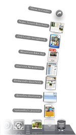 Aside from the Dock’s visual ‘enhancements’ one other new feature is Stacks. Whilst I was looking forward to using them, the reality shows it to be flawed when used in some circumstances.
Stacks are a new way to represent shortcuts to folders that have been dragged onto the Dock. However the icon for each stack is represented by the fist item in that folder, so for example the Applications folder is represented by the Address Book icon (with others of course stacked behind it). This becomes a problem once you have similar files in the Dock — suddenly you have no idea which icons represent folders, and which represent files. Not only this, but should the first item in that folder change, so does it’s representation on the Dock. Soon, the only why to know what each icon represents is to hover over it.
However, when you see Stacks work in the context of the downloads stack, you can see that in some cases, they can work really well. In fact I love the downloads stack, which combined with a spring-loaded dock (finally!), works great. Another useful example might be a project folder you’re working on.
For this reason I think the easiest and most suitable fix for this issue, would be for Apple to simply provide a few more options for how each folder is displayed (i.e. View as Stack, View as Icon). Another useful option could reinstate the contextual menu listing that was available in Tiger. Finally, Stacks really should have an additional visual indication, to distinguish them from other icons.
Finder
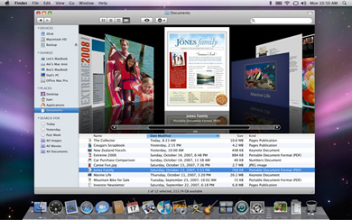
Finder, browsing a directory in Cover Flow view.
The Finder has also received a visual overhaul, and much like everything else introduced by Apple these days, its design is heavily influenced by that of the successful (and cross-platform) iTunes.
Whilst I’m glad the previous heavy metal interface has been discarded, the one problem with every application looking like iTunes is that it becomes harder to distinguish between them. One idea to combat this might be to give different applications different signature colours, so for example the left hand source list has a different hue.
Joining and browsing networks is a pleasure, and doing this is far more obvious than in previous versions. Cover Flow is relatively useful, especially if navigating a folder of images or documents, but I don’t think I will be using it on a daily basis. Quick Look on the other hand has finally meant an end to the drudgery of opening the contextual menu and navigating to the Preview application. This feature alone is worth the upgrade.
Everything Else
Aside from the Dock and a few other annoyances, I’m happy with my new world. iCal has received a much needed visual overhaul, and having a consistent interface throughout the system (which many seem to be dubbing ‘slate’) is something I have been longing to see for several years.
It’s great to see Apple finally settle on one style. Having said that, there are still a number of hangovers from the original Aqua style that I wish they would update - note how scroll bars and buttons are now a different shade of blue from that of selected menu items. I guess we’ll have to wait for 10.6 for any more updates here.
Right now, there a number of annoying little bugs (such as ‘AddressBookSync’ continually crashing, which seems to happen when you do anything involving addresses or calendaring), but I’m sure the inevitable 10.5.1 patch will fix a lot of these. Hopefully these patches will also start to iterate upon some of the areas I touched on above, if only by providing a few more options and reinstating previous functionality.
A Worthy Upgrade
So, am I happy I upgraded? To be honest not as much I was hoping to be, but I still think this is a worthwhile upgrade — I certainly don’t feel as cheated as much as I did after upgrading to Tiger. Unlike then, this really does feel like an upgrade, one that constantly reveals little improvements over the previous version, giving a real sense that during it’s 18 development cycle, no stone was left unturned.
Finally, if you are looking for a more in-depth review (and by in-depth I mean 17 pages long), then I can’t recommend John Siracusa’s review on Ars Technica highly enough.
 LloydyWeb is the home of
Comments
2 responses so far. Go on, add yours!
Hello mate,
Looks like we're thinking along the same lines with the Leopard upgrade. I didn't do a fresh install, and thankfully wasn't attacked by kernel panic, but from what I've read it seems opinion is split 50:50 whether should need to start from scratch or not (although clearly in your case I don't think you had much choice!). Luckily I appear to have avoided a 'worst-case'.
I wasn't so anti- the visual changes, but yours are very good points regarding the stacks and folders - in fact the latter is annoyingly bad compared to the old ones which were obviously different. I'm not sure how they came to the conclusion that these should be used at all. I suppose applying a coloured label could help in the short term (just tried it and it turns out System and Users don't allow this functionality).
I am enjoying the experience though, and after reading your other post too - good luck with the new job!
Andy.
I'm perturbed by the issue of Leopard losing the facility of file labelling from its contextual (right click) menu.
In order to apply a label to a number of files at once one now has to get info of all of them and apply individually!!
Am I missing something? - if not, its exrtremely irritating.