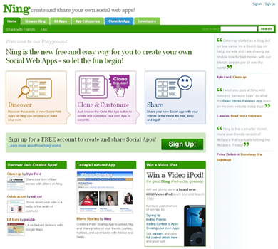
Last week saw the long awaited launch of a redesigned Ning. This is a project I have been involved with since November last year, so to finally have it out there in the wild is an achievement both I and the whole team at Ning are extremely proud of.
It is no secret that this new design is repositioned towards the needs of ‘normal people’ as apposed to the developer community (although they have by no means been left out of all the fun). As a result, there is a definite improvement in communicating what Ning actually is. Whilst the concept is a relatively simple one – a place to create and share social web apps – that idea was hidden in previous versions of the site. This design is also much more graphical – something I know a lot of people I’ve spoken too (who had seen the old site) will appreciate.
A run through some of the new goodness
- A strengthened brand identity. The new logo is bolder, more stylish and friendlier. There are also sub brands for Ning Developer and Premium Features, and a new colour palette.
- Improved use of XHTML and CSS throughout the system pages
- Gone is the ‘Pivot’ and in its place is ‘Browse Ning’ (a perfect example of how we are trying to make this new site far easier to use). You can now browse apps by category (as well as by popular, latest and alphabetically), and users now have their own profile pages (this is mine). In the last few days I have been addicted to these new browse pages as they really are great way to discover new Apps and people.
- Developers have been given a few new toys to play with too! The most exciting are the Skelton Apps that are a good starting point for integrating Web Service APIs (Flickr, eBay, Amazon, Yahoo! and of course Google Maps) into Ning Apps. There are screencasts too (with certain a British flavour courtesy of Yoz) and improved documentation too – including the new ‘Ning Basics’.
- Our example apps have been ‘snazzified’, and now include far easier setup allowing users to easily customise an Apps appearance and invite friends.
- There are a couple of new apps too. I’m a particular fan of ReviewIt and Group, but I may be a little biased as I had a little more involvement with both of these apps!
- The sidebar has a new design too – which I just love. It’s like an instant upgrade for all existing apps!
As with any re-launch of this nature, there are a few rough edges, but the team are continually improving and refining our new baby (some have even become addicted to the JIRA bug tracker). I know there are particular XHTML/CSS issues with SnazzyApps too, but the great thing is that Ning is constantly moving forward and improving, so it’s a matter of time before even these problems get ironed out.
Better still – we’ve only just started! There is so much more great stuff to come in the coming months, meaning the Ning we see today will no doubt be miles away from what we’ll see this time next year. You can take a look at our published roadmap, but that’s just half the story!
If you have any feedback, remember that ‘Ning Loves People’ so just drop the guys a line at feedback@ning.com. I have witnessed at first hand user feedback being taken on board which is really good to see.
Some Early Feedback
Overall it looks and feels bloody good, the theme fits very nicely and the front page does an excellent job of explaining what’s what. I’ll look forward to seeing the app creation tools get better, I think I’m beginning to get Ning.
- Tom Martin, Multipack
The popular social web app creator Ning gets a much-needed facelift. I’m a fan of the new look, and as Andy said, it does a better job of explaining what Ning is.
- Patrick Haney, patrickhaney.com
Read what other Ning staffers have to say
- David Sklar
- Brian McAllistar
- Phil McCluskey
So what you waiting for - go give it a whirl!


 LloydyWeb is the home of
Comments
1 responses so far. Go on, add yours!
Looking good! Aside from all the Geekery, it's pretty, and that's what matters to people like me :) Nice one mate.