I have a confession to make. Since childhood, I have been a closet fan of television idents (the bits of video that appear whilst a program is being announced). Back in the early nineties, when a channel got a new set of idents, it was a big deal, with all the press reporting on them and casting their opinions. Of course back then, there were only four channels.
For me, such launches were a rare highlight, and I can still remember my excitement of waking up one morning in 1997 to discover the entire BBC had been re-branded (not just channel idents, but a new corporate logo with re-branded BBC Radio stations, news programs, etc…). Happy days.
No surprise really then, that I ended up writing my dissertation on this topic back in 2001.
Today of course, the televisual landscape is very different, and thanks to Murdoch and chums, we now have hundreds, if not thousands of channels, most of which are of a pretty low standard and production value. New channel idents, branding, logos - even name changes - are ten a penny. It is telling however, that when BBC One launches a new set of idents, it still gets a lot of media attention, more so than any other BBC or terrestrial service.
I wasn’t going to write anything about these new idents, except perhaps to say that they are pretty damn awesome!
Simon Jobling’s post Rebranding BBC One however prompted me to expand a little on the comments I made there.
Full of Hot Air
In essense, the forthcoming idents for BBC One, have undone the mess and political correct nonsense Lorraine Heggessey threw all over the channel four years ago with those dancing buffoons. Famously, these idents did away with the popular globe that had been used on the channel for 40 years, and instead tried to conceptualise it - badly.
The last set of idents to feature the globe (which ran between 1997-2002) saw an orange, globe shaped hot air balloon float serenely over different parts of the UK (and all parts of the UK). To this day, these remain my all time favorite channel idents.
When the dancers were unleashed in 2002, we were told that the idea was to take the idea of the globe, and replace it with various dance forms from around the world, using locations within the UK as a backdrop. Instead, later additions to the ident package saw Indian/Bollywood type dancing on a studio set, Masai like warriors in the middle of an African dessert, and a cheap rip off of a Kylie Minogue video. These idents reeked of political correctness and of an idea that had gone a bit pear-shaped.
The New Idents
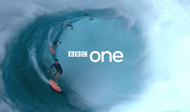
Thank God then, that on October the 7th, all this is to be replaced. The new concept is that these idents are based around a circle, but let’s not kid ourselves, it can easily be seen to hark back to the channel’s heritage, and to the globe. Given that these idents retain the red signature colour from the previous set, I can’t help but feel this is the identity package we should have got in 2002.
The BBC Logo
In his post, Si also talked about the BBC’s logo:
The corporation are fundamentally stuck with their blocky, Gill Sans BBC logo for a long time to come (think how much it would cost to change that across the board!)
I think Si may have missed the point here. The reason the BBC ditched it’s previous ‘slanted’ logo in 1997 (one that had only lasted 9 years) was many fold. It’s slanted design meant that it was hard to reproduce on screen, and it also relied heavily on the use of colour meaning it was expensive to reproduce. Finally, it just dated very quickly.
 These were all problems Martin Lambie-Nairn and his team tried to solve in the logo we see today, and I believe successfully so.
The current logo is clean, simple and uncomplicated, yet is also stylish at the same time. The use of Gill Sans gives a sense of authority and history (and echos the link between Eric Gill and the BBC - whom sculpted the statue of Arial outside Broadcasting House). Further more, its simplicty means it is very flexible, and can be applied to most designs and work as part of a larger logo (such as in these new idents for BBC One).
In fact, I tend to think of the current BBC logo much in the same way as NBC’s peacock, or the CBS eye – both of which are very simple forms, that have standed the test of time.
 LloydyWeb is the home of
Comments
10 responses so far. Go on, add yours!
I have yet to see these new idents. Although, I quite like the size and position of the BBC One text in your first image. I thought the hot air-balloon globe was alright. The dancing idents didn't really bother me, but they definitely smelt of political correctness with the black, wheelchair bound sports player! (note: I have no problem with this!).
Although I'm not an avid 'fan' of indents, I do quite like the (new?) Channel 4 ones, with the smooth camera movement to only briefly show the number four within natural/industrial/urban landscapes.
I really like the new ITV branding. The font and use of colours aswell as the position of the elements within the block, such as 'coming up next:' next and such.
I love the Channel 4 idents too - they are proably my favourite on screen idents at the moment. Channel 4 and the BBC are always top notch in how they present themselves.
As for ITV, I have nothing but distain for the whole God damned organisation (if you could call it organised!), so don't get me started on their identity!
I think you misunderstood my point about the BBC logo.
I really don't have a problem with it. I think it was one the most simplistic and powerful logos emblazoned on UK society for a long time. True - Gill Sans did have a period where it was overused but the two brands that carried it off nicely (for me) was the BBC effort and London Underground. They have lasted the test of time and are both still recognised as corporate but, at the same time, friendly logos.
Changing the BBC logo (and not the BBC One logo) for the sake of rebranding would be a really stupid move in my opinion. Keep it as it is.
I thought I should just clear that up. Your points on the whole issue are really fair by the way. You obviously know a lot about the issue. I'll have a read through your dissertation when I get a chance.
Thanks Si! Sorry if I misinterpeted your views on the BBC logo.
However, without trying to become a big head, the London Underground doesn't actually use Gill Sans, but a very similar typeface, todays version known as New Johnston
In fact I think I'm right in saying it's designer Edward Johnston, studied under Gill and thus the similarties, but I may be wrong.
'In fact I think I'm right in saying it's designer Edward Johnston, studied under Gill and thus the similarties, but I may be wrong.' -- I remember this conversation outside a pub (with a drunken opera singer outside) after one of the days at @media2006.
Sound's familiar, maybe I'm starting to sound like a scratched record!
I'm a massive fan of the bbc idents.. in fact I wait up at christmas to see what cool and creative ideas the bbc have come up with for crimbo (very disappointed in last year - did they do one??)
Any way thank god they have changed, love the hippo idea (O) but most of all as I fly power kites I'm lovin the 10 power kiters and can't wait for it to b air'd so i can see the result!
Just wanted to add.. I think the new bbc ONE logo sucks... it dosn't move with the rest of the brand.. i.e. news 24.. unless its moving that way.. ok last of my bbc blogging rants!
We've all been there.... come on Gaz, share it with the group...!
Personally, I would expect the other idents to fall in line over the course of the next year or two. I'd predict BBC Two early next year, BBC Three in the Summmer. BBC Four has only recently rebranded (or got new idents) so I would expect them to be adjusted rather than see any wholesale changes.
Come back in a year, and tell me if I'm right!
(As for BBC News 24 and Parliament, they are kind of different beasts. But I hope to dear God they update News 24's on screen presentation package, it's so poor. Their on the hour idents however are fantastic!)
I am also a big fan of idents and cannot wait till saturday.