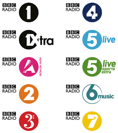
Like fellow Multipacker Andy Higgs, I’ve been noticing the rumblings of change happening at BBC Radio. This last month has seen the gradual introduction of a new set of station identities, designed by Fallon, that should be fully rolled out by the end of this week.
Continue reading “Thoughts on the New BBC Radio Logos”
So Monday saw the much anticipated reveal of the most significant identity to launch in Britain since that of the Millennium Experience in 1999. My immediate action upon seeing it was one of restrained joy - it was great to see something new in a category of identities that have remained pretty conservative and predictable over the last 40 years.
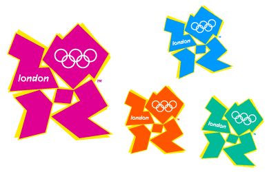
However as I look at this identity more, it quickly becomes obvious that it has a number weaknesses as well as strengths. Yet sadly the proper debate about the relative merits of this logo have been sidelined by the usual sensationalist journalism that we have come to expect in Britain.
Continue reading “2012 and all that”

I have a confession to make. Since childhood, I have been a closet fan of television idents (the bits of video that appear whilst a program is being announced). Back in the early nineties, when a channel got a new set of idents, it was a big deal, with all the press reporting on them and casting their opinions. Of course back then, there were only four channels.
Continue reading “The One to Watch”
When iTunes 4.9 was released a few months ago (yes, this is a very belated post), it finally included support for download and playback of Podcasts. With this new method of delivery, so it became important for podcasters to supply album artwork that would be displayed in the application and throughout the iTunes Music Store.
Continue reading “The Art of Podcasting”
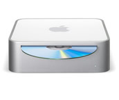 Another MacWorld Expo, another slew of gifts from Apple. The new ‘Mac mini’ is just what the company has needed to have been selling for a long time, too long in fact. With this product (aimed squarely at the PC buying consumer) alongside the continued success of the iPod, Apple is slowly becoming a mass consumer brand.
Continue reading “Opps, we did it again!”
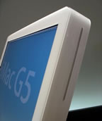 Apple today announced it’s 3rd generation iMac. Keeping to the all-in-one form factor, this revision sees the LCD screen mounted alongside the G5 powered CPU and other hardware, mounted on one leg - reminiscent of the recently released Apple Cinema displays.
I can’t help but notice similarities to the original Macintosh of 1984 - well from the front, certainly not from it’s 2” side!


 Another MacWorld Expo, another slew of gifts from Apple. The new
  Apple today announced it’s