Sunday evening finally saw the launch of a completely rewritten version of LloydyWeb - the seventh incarnation of this site. You can read a brief outline of what’s new here, and a run down of some of the technology that drives it, is described in the Colophon. Needless to say, given that the previous site had been around for over two years, the code is massively improved upon (and bursting at the seems with microformats), and I’d like to think the design is a little more up-to-date with current trends too.
One of my key goals with the new design was to removed a lot of the redundant content that had been hanging around like a bad smell in previous versions of this site. However, interesting essays and articles have been archived in the new Vintage section, or incorporated into this blog (where some of this content probably should have gone in the first place).
The same is true for the few reviews I have written, which are now a category within the blog rather than a dedicated (and sad looking) section. Hopefully this means I’m more likely to jot down any thoughts I have after watching a movie, going to a gig, reading a book, or listening to an album.
If you read my post earlier in the year about this site (see Paul’s blog still 1.0), you would have known that this re-design wasn’t far off. Re-reading that post I would like to think I have achieved a lot of what I set out to do all those many months ago, but yes, it has taken me this long to build the damn thing!
Interestingly, not only have I decided to backdate the blog (is that a blogging crime by the way?), but I also decided to keep the really old (and embarrassing) entries, and indeed they should now be easier to find, with the improved categorisation.
Finally, this initial release is very much about setting foundations to build upon. There are a few pieces that I’ve had to compromise on, areas that remain unfinished, and I can see me playing with the design a lot over the coming months and years too.
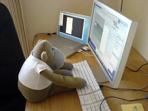
Good work Monkey!


 LloydyWeb is the home of
Comments
13 responses so far. Go on, add yours!
Good work my friend, not so sure about the small type on the posts (maybe 0.1em bigger?) but the rest is looking very suave indeed, I'll enjoy looking around and trying to break it.
Very neat and clean Paul.
Agree with Jon about the small type for the posts, it could be a little bigger. Also there seem to be some javascript errors on this page.
Ditto with the font size, and ARGH scaled images! NOOO.
Hmmm... Very nice, but i dont know if i like your old one more, i need sun glasses to view this one ;)
I like it! Its nearly as good as roobottom.com
Oh but I dont like the fact that you cant see the number of comments before clicking 'continue reading'
You can on RDC
Oh sorry, I see that you can! I stand corrected! Its just that it was hard to spot, you'd never get 'hard to spot' things on RDC.
Well at least you now feel able to use the comment form Kris - blimey!
Thanks everyone for your comments. I'll take a look at some of these issues in the next couple of weeks!
Yeah, I agree with Kris about rdc, sounds like an amazing site.
Where's your feeds? Looked everywhere.
I told you'd i'd comment all the time once you made the form work properly, which i'm pleased to see you have.
Wow.
(falls out of chair)
Ouch.
WOW!
Paul:
I've noticed that ever since you returned to the Bay Area, the weather has been glorious. Maybe someone should start a "Thank Paul" app or website to show their appreciation.
--Roger
Hi Roger,
I think it's a case of my presence having the opposite effect on the Bay Area's weather system. When it was meant to be getting warmer and dryer, it got (very) wet. Now, at a time when you would expect bad weather to set in, the opposite is true. Let's hope it stays that way for a few more weeks at least!
Also, this app may just do the trick: blesspaul.ning.com